Plotting data from Postgres in R
• • ☕️ 4 minute read
In my internship I work with IoT data which I pull and store in a PostgresDB. While querying provided me of a good way in getting some basic insights, a visual approach would even be more satisfying. Before developing extensive analytical dashboards I wanted to experiment with some essential data visualisation techniques, so I decided to give old R a shot as it integrates nicely with multiple databases by the use of DB interface drivers.
Connecting to the database
In this step we use a Database Interface Driver to make a connection with our DB enmeasurementsoint. This can be the localhost, a cloud service or even a Raspberry Pi! Note that we can construct queries whereby the SELECT statement arguments will become are table attributes in R. A benefit of using a DB driver instead of working with CSV files is that we can leverage the powerful SQL language in order to do data grouping, aggregation, sorting and adding search criteria.
library(DBI)

# Install the latest RPostgres release from CRAN:
install.packages("RPostgres")

# Connect to the default postgres database
con <- dbConnect(RPostgres::Postgres(),dbname = 'DATABASE_NAME',
                 host = 'HOST', # i.e. 'ec2-54-83-201-96.compute-1.amazonaws.com'
                 port = 5432, # or any other port specified by your DBA
                 user = 'USERNAME',
                 password = 'PASSWORD')

# Collect your data
res <- dbSendQuery(con, "SELECT value, timestamp FROM measurements ...")
measurements <- dbFetch(res)
dbClearResult(res)
Plotting the timeseries
As my timestamps are in the ISO-format, I need to parse them first in order to be able to use them in the plots.
All my plots are inspired by two very important works:
- Edward Tufte, The Visual Display of Quantitative Information
- Kieran Healy, Data Visualisation: A Practical Approach
In summary, the most elemental principle is that of minimalism with reduced ‘data-ink’. As Tufte explains, the ‘data-ink’ (total ink used to print the graphic) ratio should equal to ‘1 - proportion of graphic that can be erased without loss of data-information’. The primary challenge is therefore to modify the default graphs produced with R so that we remove as much of ‘non-data ink’ as possible.
For ggplot2, a nice way to style the figures is by using themes.
library(parsedate)

# transform the timestamps
dt <- parse_date(measurements$timestamp, approx = TRUE, default_tz = "UTC")

# plot the data with basic method
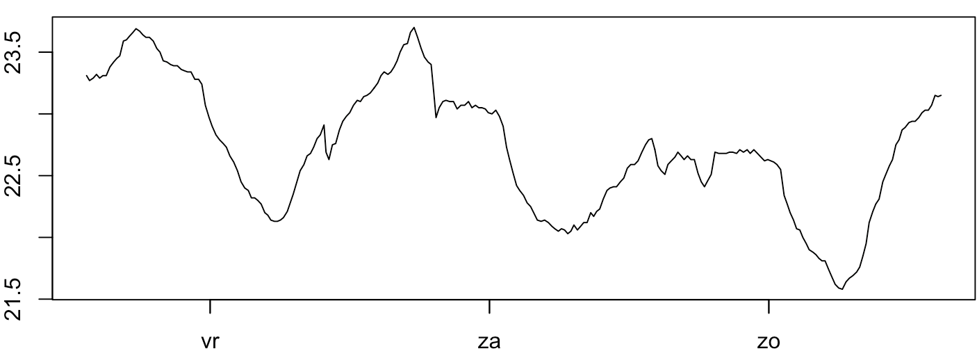
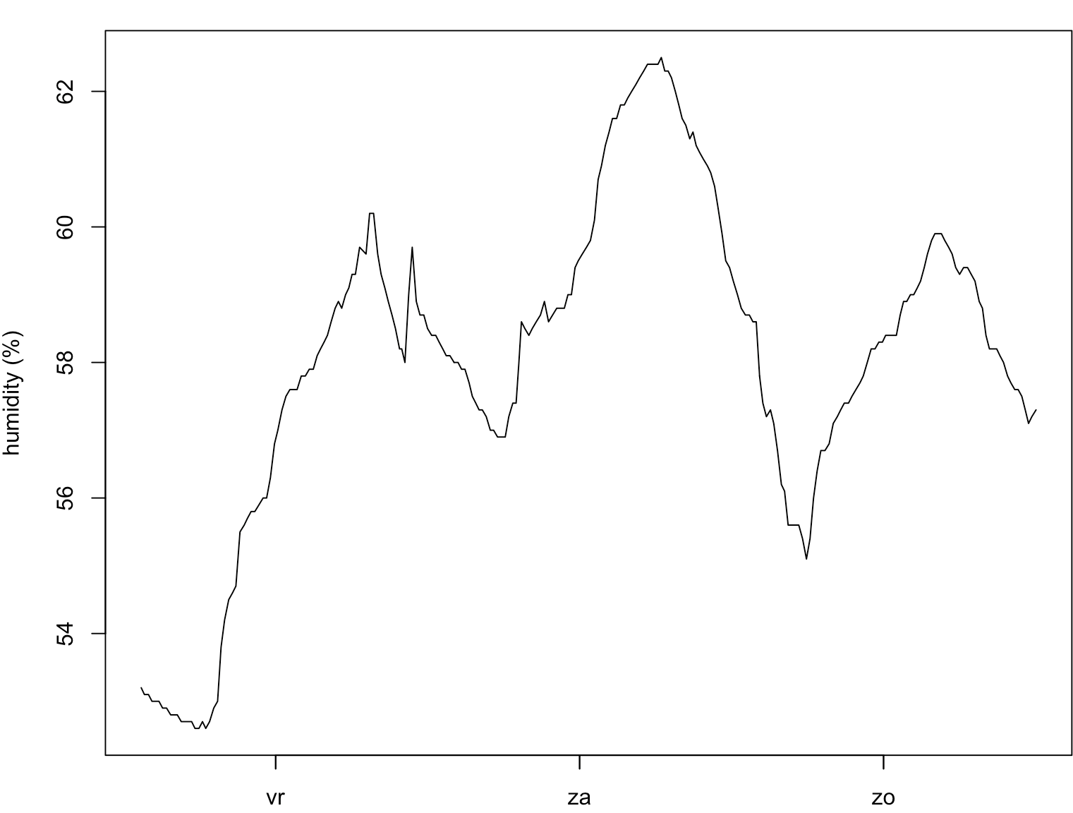
plot(measurements$value~dt,type="l", xlab="Time", ylab="Unit", main="Measurement")

# plot with exponential smoothing with ggplot2
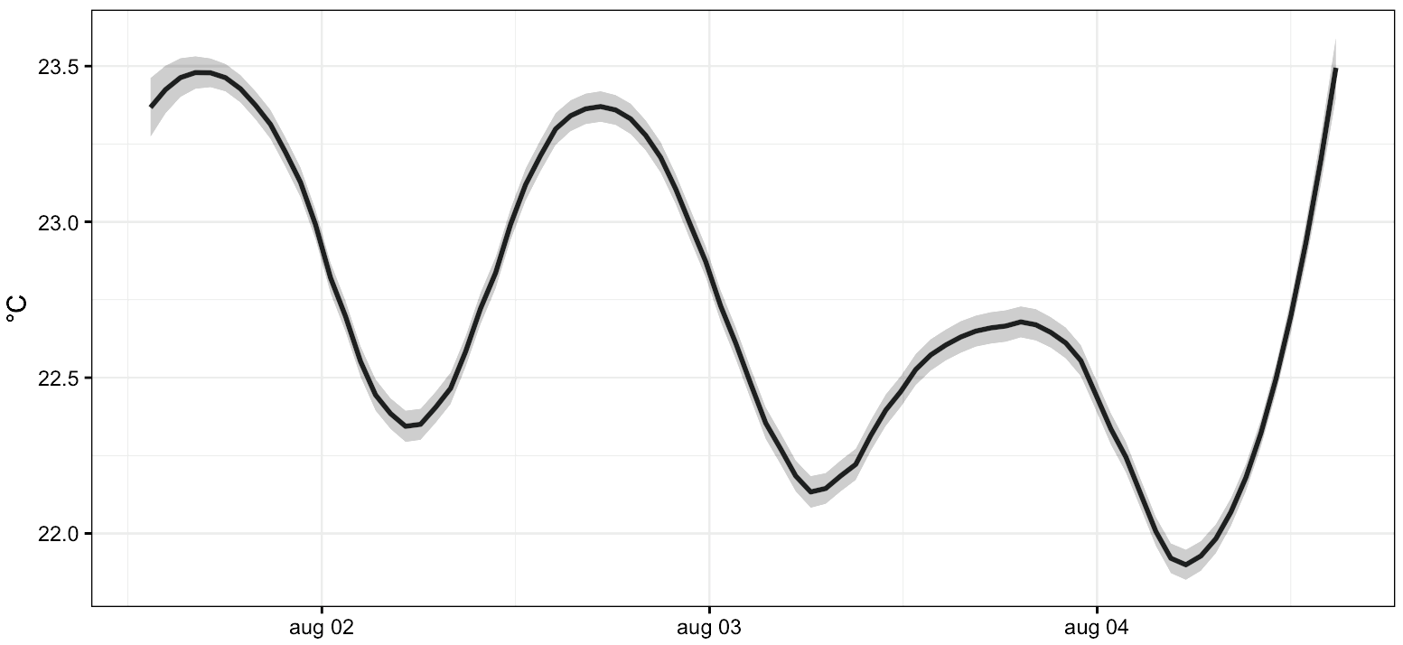
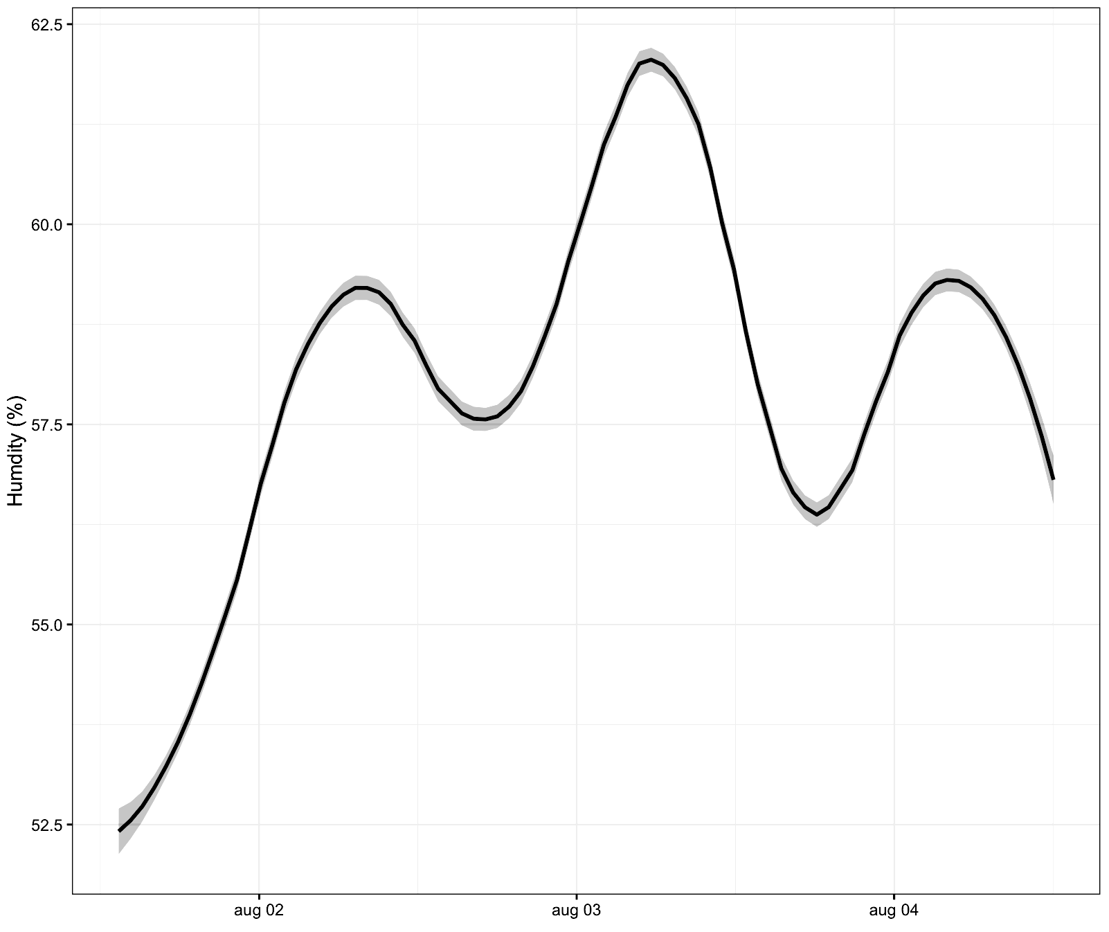
qplot(dt, measurements$value, geom='smooth', span=0.2) + theme_linedraw()
Some examples with real data collected from my IoT devices
Constructing a histogram
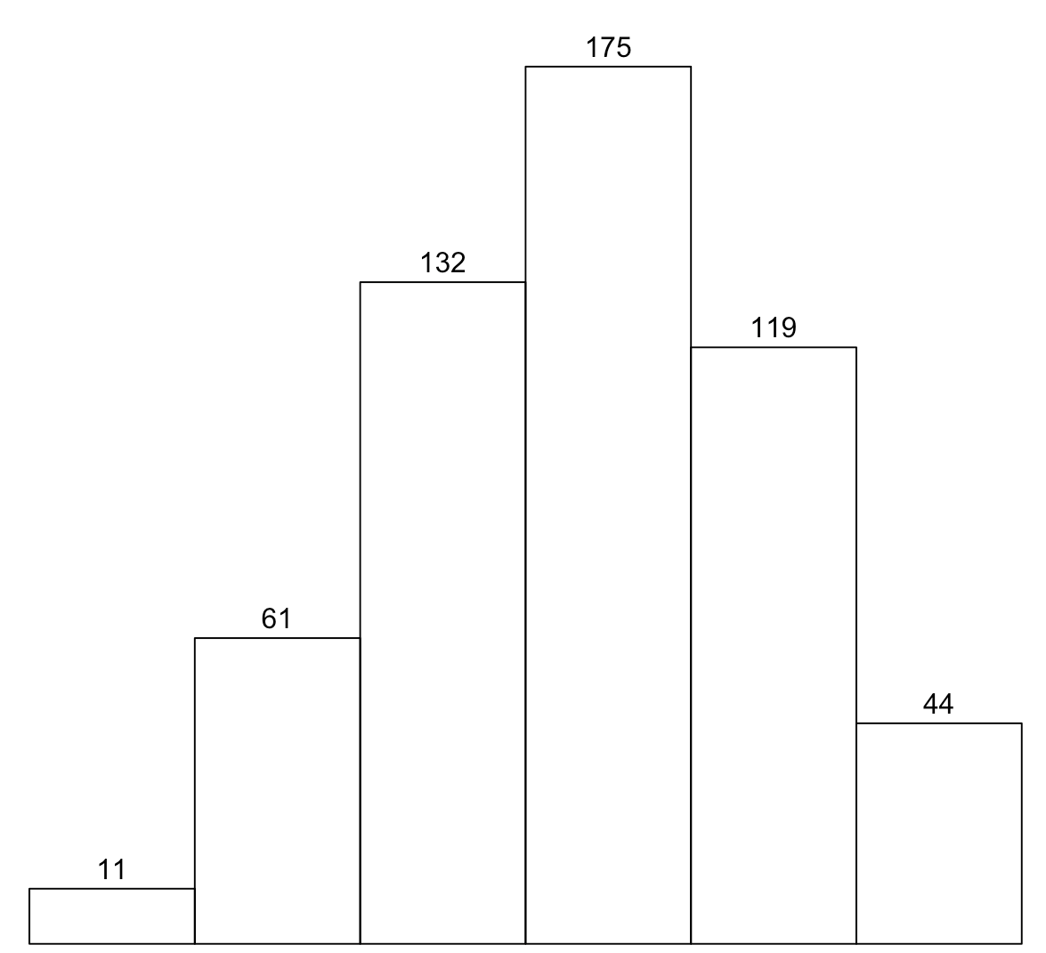
Plotting a histogram is really easy, small tweaks are applied to show the numbers above each bar. The Tufte Boxplot is generated with the PerformanceAnalytics library, which has a dedicated Tufte theme. More dynamic charts can be generated with the earlier mentioned frameworks, this will be the focus of future dataviz articles. When we combine both histogram and boxplot (by the use of the gridExtra package), we obtain a well designed result:
library(PerformanceAnalytics)
library(gridExtra)

# generate the histogram
h <- hist(measurements$value, main="histogram", xlab="unit", breaks=10)

# generate textual representation of the values for each bar
text(h$mids, h$counts, labels=h$counts, adj=c(0.5, -0.5))

# generate the boxplot
b <- chart.Boxplot(measurements$value, element.color=transparent, as.Tufte=TRUE)

grid.arrange(h,b,nrow=2)

Density Plots
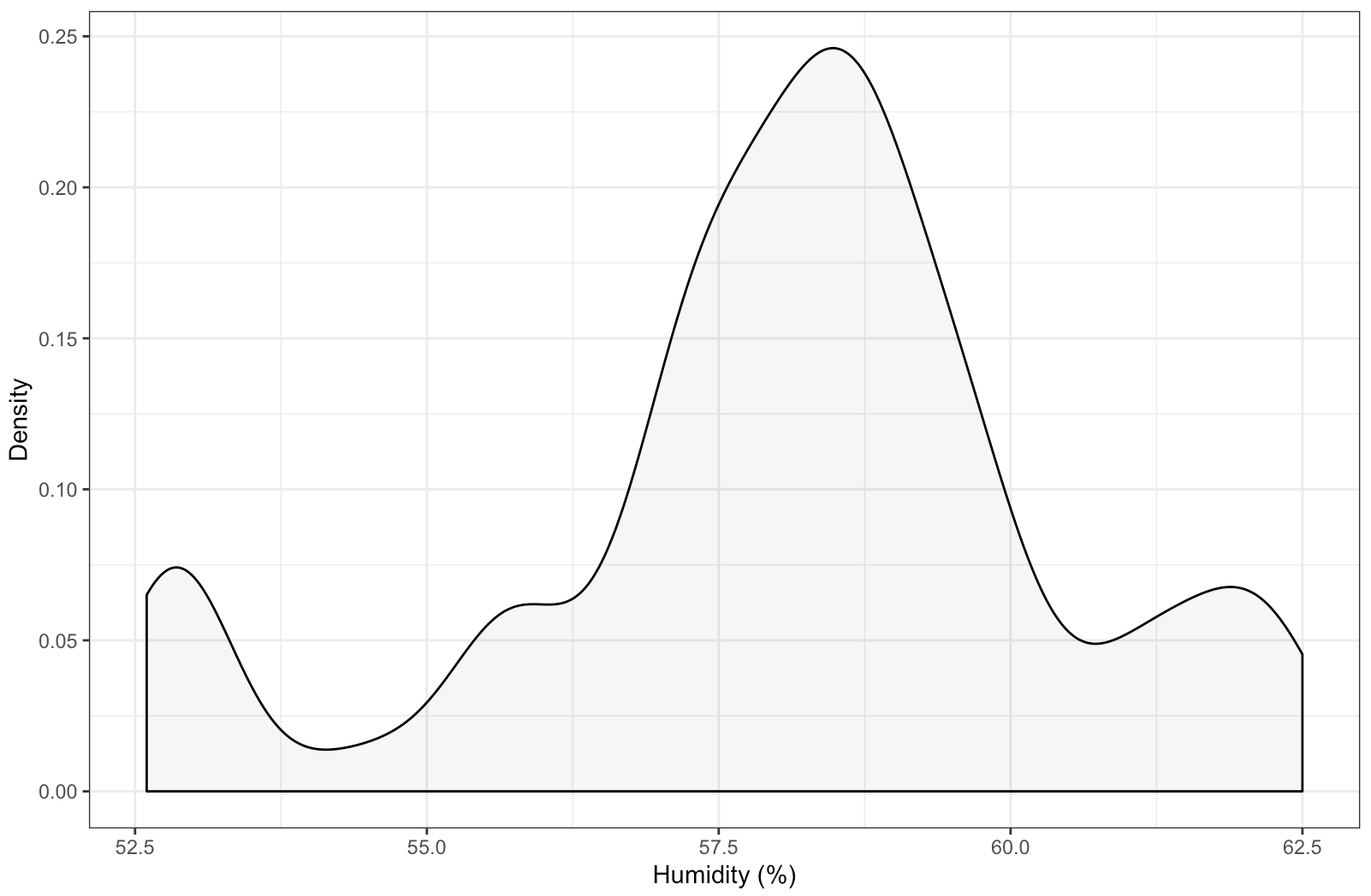
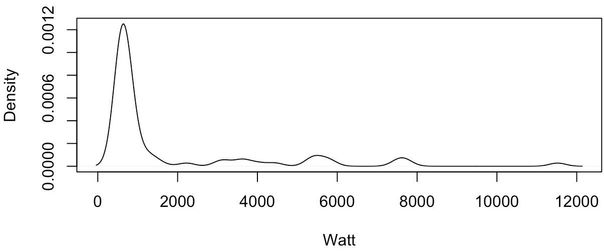
Related to the histogram is the kernel density plot which we will construct next:
# generate with ggplot2
qplot(measurements$value, geom="density", fill="#FF9999", alpha = 1/10) + theme_linedraw()

# generate with the basic method
d <- density(measurements$value)
plot(d)
As can be seen from the results, both results are nicely formatted.
More to come…
R offers quite interesting features for data scientists and ML researchers alike. Tidyverse revived the language by providing intuitive and easy to use packages. I will cover more use-cases in the near future on how I use R in my daily projects.